|
|
Post by Calenture on May 4, 2010 12:07:29 GMT
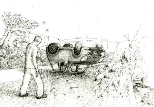
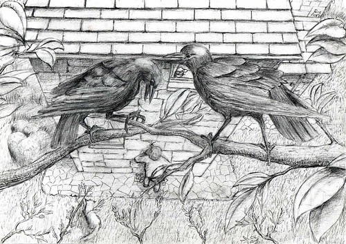
Illustration for Devil At Your Heels by Robert Mammone. Finished last night after god-knows how long. Felt too paranoid to post it here after yet another long absence, so just passed Rob the link to it then. Originally I drew a classic Mini, then realized Rob had described it as a late-model car. Possibly identifiable as a hybrid after corrections. Made so many corrections in fact over so long a period (weeks) that was in danger of rubbing a hole in 140 Ib paper. Tried to get the sense of awful isolation and desolation Rob put into describing the scene. For Penni McClaren Walker's Easy Money. This one was finished before the other sketch here, and took almost as long. The watching crows (or 'corbies') seemed like a sort of motif for this story and helped add interest to the drawing of the house, which for reasons I can't explain (read the story) I couldn't cover in ivy and moss. Anyway, now I'd better get rid of the World of Warcraft spam clogging up the board... More illustrations coming. |
|
|
|
Post by Craig Herbertson on May 4, 2010 18:45:12 GMT
Your illustrations deem to be getting better and better Rog. I should point out that Penny Mclaren Walker is Penni Mclaren Walker.
|
|
|
|
Post by Calenture on May 4, 2010 21:33:11 GMT
Your illustrations seem to be getting better and better Rog. I should point out that Penny Mclaren Walker is Penn i Mclaren Walker. Thanks for correcting Penni's name, Craig. I'll put that right. These two were the toughest of the five pictures I've been working on. I'm very hesitant about drawing; the process has slowed considerably for me since the first FCs, with usually just a mess of faint lines and dashes across a page until I figure out which ones shouldn't be erased. Both these sketches had me holding my head in my hands with frustration at some point, and a couple of nights back Coral was asking me if I shouldn't try making a light-box so I could trace something on a near-ruined page onto a fresh sheet and start again. In the end of course, it feels worthwhile. |
|
|
|
Post by Craig Herbertson on May 5, 2010 9:40:46 GMT
Definitely worth the hard work. it looks to me like a major shift in an artists perception - which is bound to be difficult  |
|
|
|
Post by Stephen Bacon on May 5, 2010 19:42:12 GMT
Stunning artwork, Rog. Nice one.
|
|
|
|
Post by Calenture on May 6, 2010 21:30:29 GMT
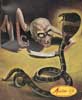
For Rage by D F Lewis. Rage is one of those perfect straight-faced miniatures that Des does so well. A little while after reading it I started chuckling. Coral wondered what I might have taken. Then she read it, and she started giggling, too. Today I had my second panic attack since I started finishing and posting these, wondering if the picture would fit Des's story. Coral reassured me. So here it is. One of my regrets is that I never got a story into Nemonymous, and it's sad that the series is now ended. But I'm also glad that Des will have more time to devote to his own writing. I'm not sure about that "major shift in perception", Craig. I guess the drawing has changed slightly as I thought about the magazine illustrations I liked to look at, and found shading techniques that seemed to work best for me. Thanks for comments all. |
|
|
|
Post by Craig Herbertson on May 10, 2010 11:46:32 GMT
trust me; you're art's looking remarkably good nowadays
|
|
|
|
Post by Calenture on May 10, 2010 12:22:57 GMT
Last night I did the finishing touches to an illustration for Stephen Bacon's story, but worked too late and kept getting the Photoshop 'cleaning up' process wrong.
Just trying to get it right now, without the lines pixelating.
After that, one more to finish, suggested by a line in James Stanger's story - but which is a very loose interpretation, so could illustrate more than one story (I have another in mind, if there's room in the magazine). I've come to think of this issue as a Special Paranoid Issue, prompted by the nature of most of the stories, and partly by my present unbelievably nervy state.
After that, I have to decide on the cover picture - which probably will need to be one of those in 'portrait' format.
|
|
|
|
Post by Calenture on May 10, 2010 13:42:49 GMT
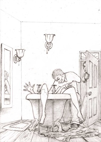
For A Solace of Winter Rain by Stephen Bacon. This was the first drawing started and presented some odd complications in the final clean-up stage, last night and this morning - usually it's a case of just adjusting a few sliders in Photoshop. I might go back to that when I'm in a less edgy state, but for now I think it's at least presentable. |
|
|
|
Post by Stephen Bacon on May 10, 2010 20:18:57 GMT
Wow - Rog. You've no idea how thrilling it is to see such a great piece of artwork based on something I wrote. I love it.
|
|
|
|
Post by Calenture on May 10, 2010 21:18:37 GMT
I'm glad you like it Steve. I think if it wasn't for the stories in FC, I'd just have carried on drawing occasional half-dressed warrior women - not that that wasn't fun, but it wasn't particularly challenging. For the illustrations so far I've had to find photos of Mini cars, Australian lizards (bottom left of first picture above), crows, architecture, Victorian/Edwardian bathroom design, and so on. I'd better keep thinking in terms of 'illustration' rather than 'art', or I'll start getting ideas about myself. I'm very fond of Norman Keene's illustrations for John Gawsworth's antique 'superdreadnaught class' horror anthologies, as discussed at Demonic's earlier labour of love, Gruesome Cargoes - which sadly never really gained a following. Proof if any was needed, that there's only one Vault. Anyway, as I said, I'm fond of that style of illustration, and Solace seemed well-suited to it. Now if I can just clean it up properly without losing details... |
|
|
|
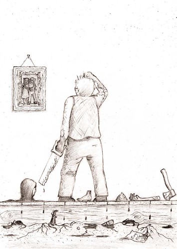
Post by Craig Herbertson on May 11, 2010 7:32:38 GMT
Here's an example,
this drawing is particularly good because of the three men appearing - murderer, other guy and what makes it the mirror image - reason. It gives it that dreadful male voyeuristic feel - like spectators at a strip club - which makes for a mix of guilt, distaste, disgust and generally heightens the horror by square roots. Remarkably horrific picture. That's the kind of perceptual shift I am seeing
|
|
|
|
Post by Calenture on May 11, 2010 14:12:40 GMT
The most important thing about the illustrations, I think, is that they match, fairly faithfully, the mood and the scenes described in stories contributed for FC by their remarkably talented authors. The coming issue is likely to be the strongest of the six. I have had mad moments when I've wondered if I could include all the previous contributors, and I've wondered if it would be better to try to make it an anthology - even an illustrated anthology. But probably the delay and effort of that right now would be a serious mistake at this stage, with the time available. I suppose if I'm honest the drawings are something I've come to take more seriously, as I've winced at mistakes I've made in previous issues and noticed too late - possibly the biggest mistake was in the first issue when I drew the crucified girl for Victoria J Dixon's Martyr's Window. Victoria's character had explained that she had 'decided against building an actual cross', but somehow I forgot that and went ahead and drew one - two versions, in fact. I never was able to get the effect I wanted of soft lace on a sensual body with nails going through it. Fortunately Vicky liked the sketches anyway. Last FC, when I drew the double-page spread for Franklin Marsh's last instalment of The Horror on Dreadstone Moor, Franklin had described a print of 'that awful green woman' in the room - which most of us must remember seeing everywhere in the 'seventies. I missed that - lost opportunity! - and drew a vague detail of an ancestor's portrait instead. I also missed Perdita's baby-doll nightie! I've already mentioned the correction over the type of Mini car above. But I'm fairly happy with the results; just wish there was more time. The reflection in the mirror in the Solace drawing was a last minute addition, but I have to admit I felt happy when the thought came! Thanks for your thoughts. I think I'll change the '30 most recent posts' thread to '100 most recent', because with such limited time there's the risk that posts are missed. We'll see how it works - but that'll be a bit later as I have to collect a monstrous 6-year-old from school now.  |
|
|
|
Post by benedictjjones on May 11, 2010 19:49:54 GMT
realy like the drawings rog - they seem to have a 'cleaner' look than some ofthe stuff in earlier FCs. great stuff. really looking forward to 6!
|
|
|
|
Post by corpsecandle on May 19, 2010 17:59:22 GMT
I know paranoia isn't fun Rog but from what I witness of the illustrations there are some seriously grusome and inventive storys in this volume of F.C.
I really do enjoy your style Rog and I feel when you write you have to allow some liquidity in the translation from the written work to the artists image. Infact it's fun to see how another person interprets what you have written,I really love the image you created for Rage,I am more than intrested in this issue.
|
|